Introducing the Brand Style Guide with Brand Lock technology. SPINNR is a world first cloud-based WordPress theme designed with a mobile-first approach for modern website development. The Brand Style Guide offers unlimited customization, allowing for detailed adjustments to the styling of your website and its components, from headings to container settings, ensuring your site aligns perfectly with your vision even beyond go-live. The Brand Style Guide is tailored to web agencies’ needs, allowing your developers to speed up development with more consistent quality and results.
Containers and grid
Containers
SPINNR allows you to create and maintain a container system, which can be changed any time site-wide with just a few clicks.
You can set the default section padding and gaps for every major screen size. By default it uses standard, widely used container sizes: 1140px for desktop, 768px for tablet and 100% for mobile. However, you can easily configure these to suit your needs. To do this, click on the «Configure container sizing» button.
You will see a window, where you can configure the size of containers for all different screen sizes. You can choose from the set of standard sizes or make it completely custom, it’s up to you. You may create some additional breakpoints as well, if you need more than the default four.
It is also worth noting, that in most parts of the Brand Style Guide we only have «Desktop» tab in settings. That means that these settings will apply to both desktop and laptop breakpoints, because they are usually different only in the width of a container and not in the element styling and sizing.
For the 100% width of a container you can set up a default padding, this is mainly applied to mobile and tablet screen sizes.
Grid
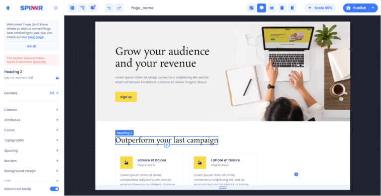
By default all standard SPINNR components use a 12-column grid system. This is not configurable through the Brand Style Guide. You can configure specifics of the grid through the Page Builder (Canvas), such as the number of columns or rows.
For the layout we use «grid» CSS property.
Scaling
In the Brand Style Guide system we use a scaling system to introduce consistency in designs. Although you still have an ability to make any custom changes you want, for the most part the values you are able to pick for sizing of HTML objects are restricted by the Scaling Table. The default set up provides optimal scaling values, so you don’t need to worry about them, but if you need to edit it, there is an option for it:
The Scaling System is divided in three parts: Font, Element Spacing and Element Sizing. A lot of the time fonts may have slightly different scaling needed, that’s why it’s is separated. Element Spacing is what you will use most of the time when setting up paddings, margins, gaps, etc. Element Sizing is used primarily for big objects such as images.
Aside from providing consistency, this system is convenient in the situations when you might want to reduce all your 80px paddings to 60px. Instead of changing them one by one in Page Builder or CSS code, you can just change this one number here.
Still, we do recommend using the default scaling settings as they are most commonly used and generally optimal.
Font Configurations
The Font Configurations section of the Brand Guide allows you to create sets of font rules that you can later apply to your text element. Don’t confuse this with choosing the font for your website. Yes, you can choose a font, but the purpose of Font Configurations is to allow you to set rules, for example when you need to set up backup fonts as well.
There are 4 default font configurations that cannot be deleted from the Brand Style Guide or renamed, although you can edit their font-family property. Additionally you can create as many new font configurations as you want.
Adding fonts
To add a new font to the Brand Style Guide, click on the «Manage Fonts» button. It will open a window, where you can add new fonts.
All you need to do is insert an embedded code with @import. You can get this from Google Fonts or other sources.
After adding a font, just create a new Font Configuration and specify the new font there or add it to an already existing Font Configuration.
Elements Styling
Text Elements
Under the «Headings» section you can configure all default text elements used in the Brand Style Guide, such as headings 1-6, paragraph, link and footnote.
Use the dropdown to choose the element you want to configure. You may notice there is a «Global» tab there. If you change some settings while being on the «Global» tab, these settings will apply to all screen sizes. Usually it’s useful to set up everything except for the font size and bottom margin, so you don’t need to input the same settings over and over again for every screen size.
There is also the «Usage preview» toggle that shows you a heading and paragraph sample so you can see how it will look like.
By default we already have set up system for font sizes and if you want to go back to it at any point, you can click on «Reset sizing»
Buttons
For Buttons we have a default of three buttons: CTA (Call to action), Ghost and Text. You may have also heard them called Primary, Secondary and Tertiary buttons. For each of these buttons we have 3 different sizes.
The Brand Style Guide allows you stylize buttons pretty much however you want, but if you want something very custom, especially in terms of button structure and animations, or you want a few sets of these buttons, you have to do it through Advanced Mode.
Input Fields
Although in the current version of SPINNR we do not yet have our own input field/form functionality, we have a styling system that can be easily used with external plugins.
The styling of input fields in the Brand Style Guide is pretty straightforward. Additionally we bind the height of the input field to a button of your choice, so that there will be no accidental differences in size.
Tables
The Brand Style Guide allows for changes of the basic table look, such as size, styling and font.
Images
The Brand Style Guide has a few default types of image styles which you can use in your designs, allowing for consistency. Some images you may want to be the exact width and height every time you use them and some you may want to be flexible and SPINNR allows for this flexibility.
Additionally, if you need some more image types, you can create your own. For that just click on the plus button.
You will see a window, where you can name your new image style, and than after saving it you can just configure it as you want.
Cards
Given the fact that cards are a pretty common element in web design, we also made them a part of our Brand Style Guide. You can change their style for every screen size.
Do note, that if your were to explore the classes of cards, you will find that visual settings are divided into two separate classes: .card and .card-body. The latter is responsible only for paddings of the card body. It is made that way, because from time to time you want elements be inside of a card, but you do not want them to have padding like the body of the card, which may consist of title, description, a button and more.
Colors
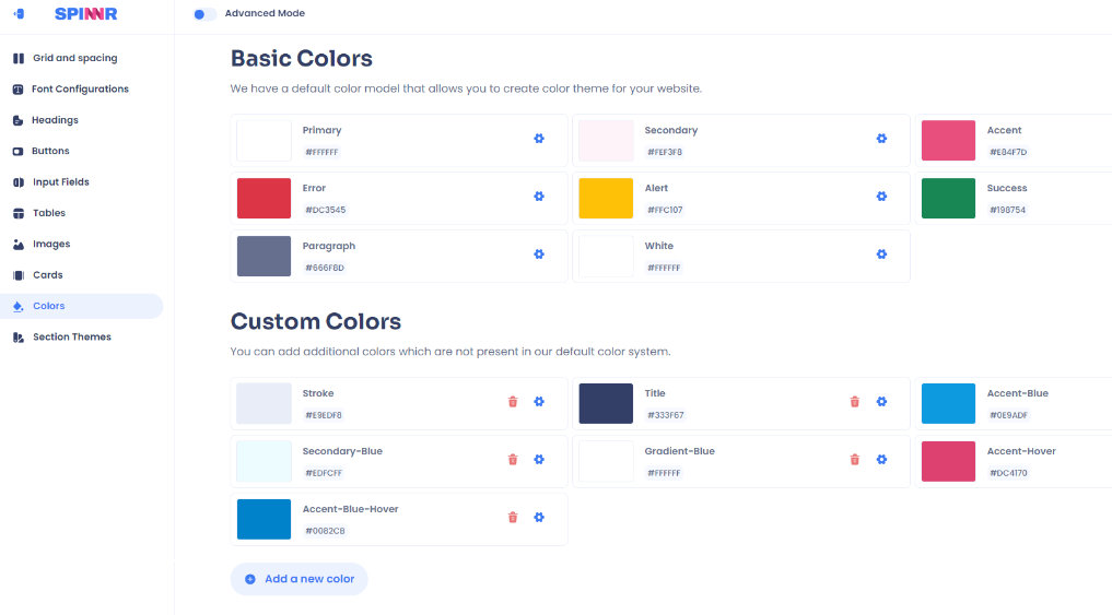
The Brand Style Guide has 8 default colors that are necessary for the basic components and a basic theme of a website. You may change them, but you cannot and should not delete them. If you need any number of additional colors, you can add them in the «Custom Colors» subsection.
After you create a new color item and save it, open its settings and set a color value you need. We also suggest you to not use spaces in the names of colors.
Section Themes
This section of the brand guide is dedicated solely for the purpose of setting colors for elements. By default you only have one section theme set up, but you can create more as you need to.
Section themes allow for the fast switching of color schemes for individual sections. This is very powerful and is especially useful for end-users to be able to easily apply color changes to various sections quickly and easily. For example your website is mostly white, but some sections you want to be dark or slightly colored. You can make the themes for these cases and change the color scheme of the section in a few clicks.
Advanced mode
Advanced mode gives you direct access to the Brand Style Guide files like config and CSS styles. Basically it is all the same information, but in the form of code and with an ability to expand on some options, like creating a second set of buttons or making more size values.
Config
Advanced mode gives you the ability to modify the CSS and JS files directly, that store most of the values and settings of the Brand Style Guide. If you need something outside of the basic Brand Style Guide capabilities, you can modify it here.
Brand Guide as CSS files
All changes that you make in the default Brand Style Guide view are stored in a form of CSS files and, of course, sometimes default options are just not enough and you need more variations. In this case you may modify CSS files directly in the Advanced Mode, although it is not advisable, because it’s is easy to mess up the structure and default view may not work properly. It is important to note that if you make changes to the CSS or JS in the Advanced Mode, you should not go back to using the UI mode as that will overwrite your customisations!
Custom CSS
In the section and file «custom.css» you can write any CSS you want, and it’s advisable to do it here and not in the other Brand Style Guide related CSS files.
You can write CSS in its default form and you can also do in in form of Tailwind classes.


